Logo Design
This design was done as part of a workshop for film and tv. The workshop’s purpose was to teach how to design graphics for film and tv (including how to make the props with the graphics applied)
Objective: Design a contemporary ND (Non-Descript) Tomato Soup Label.

Logo Designs
For the designs, I aimed to make them look generic while drawing inspiration from existing brands. For the top design, I wanted to make a logo that would appeal to kids. I wanted to play up the playful/fun aspect of the logo.
For the other logo design, I wanted something that would be a good contrast to the fun/playful design. Hence, I went with a caligraphy-style font to help give the logo a bit of sophistication and elegance. I also decided to rely on a black-and-white color scheme to depict a more minimalistic/reserved look. These are traits I would associate with a more mature demographic.
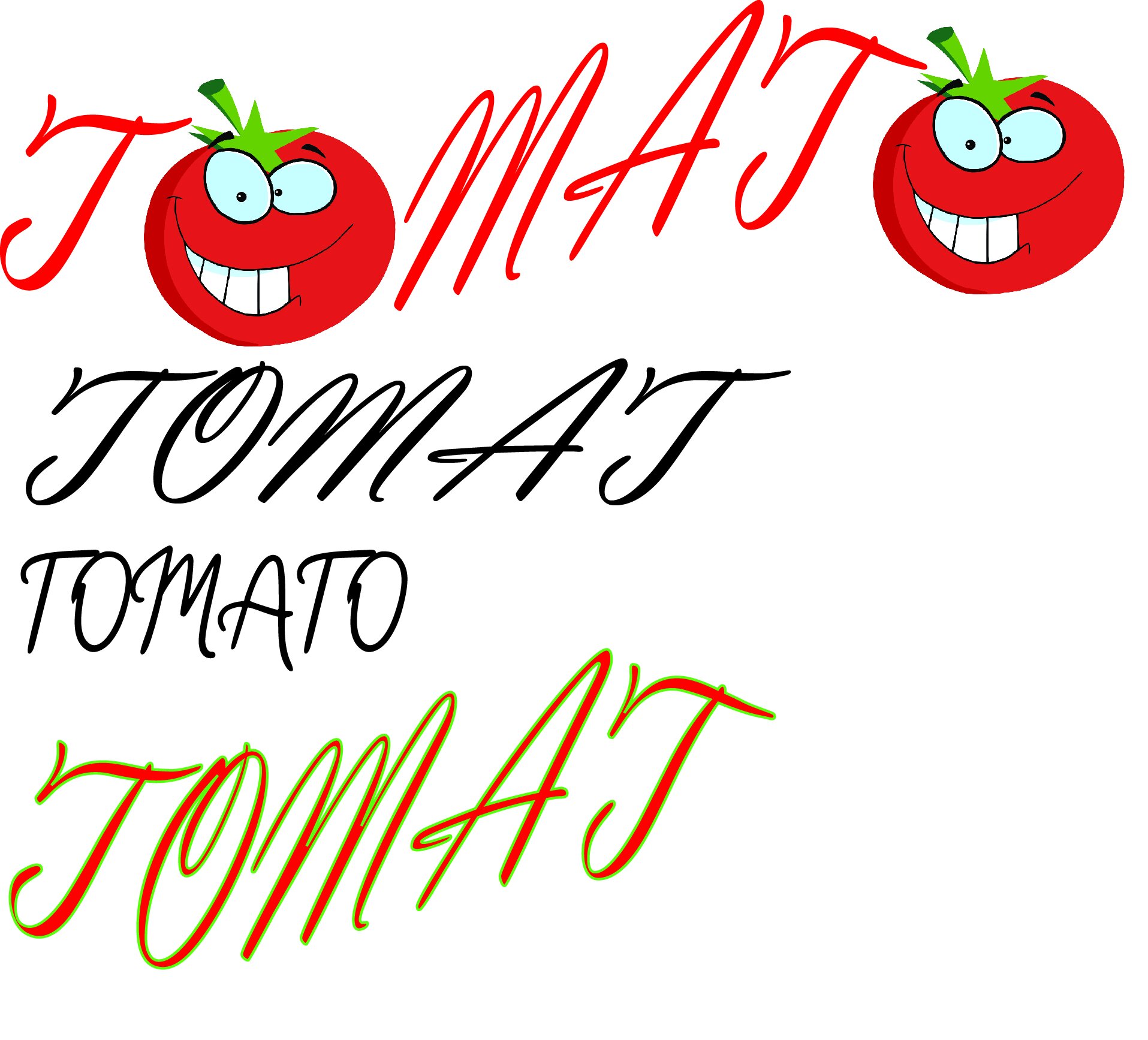
EARLIER LOGO DESIGN
Here are some rough attempts at mixing the two styles. These were done while trying to figure out a good approach to the more mature version of the logo. I knew from the start that I wanted the font to be either script or calligraphy, but wasn’t sure about the best way to incorporate it.